

Microsoft Excel is an extremely popular Office application among students, offices, researchers. It facilitates a plethora of options to create a huge table. You can create graphs, pie charts, trends of a particular business or scientific model and so on. The numbers of features are almost endless.
As we all know, MS Excel is often used as an efficient data analysis tool. We often work with huge data set, and to understand about the nature of the data, the trend, the variation, we have to perform data analysis on our data. This is done with the help of Data charts, graphs, sparklines, etc. Charts give you a pictorial representation of the data you are working with, and you can understand the pattern of your data in a more transparent way. Quick analysis enables you to perform many more formatting like color codes, greater than, less than, icon set, color scale, etc. There are provisions for various tables, pivot tables, charts, etc.
Steps To Perform Quick Analysis In MS Excel
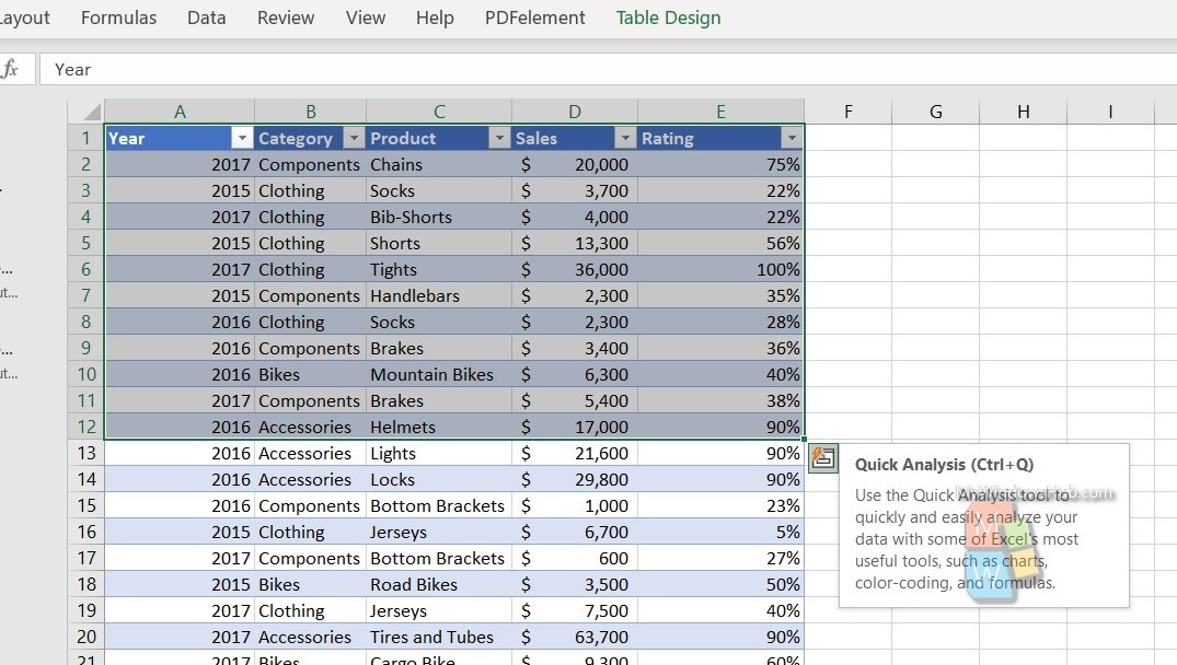
First, you need to select the entire range of cells of data, you want to analyze.
Tap on the Quick Analysis option or simply press Win+Q.
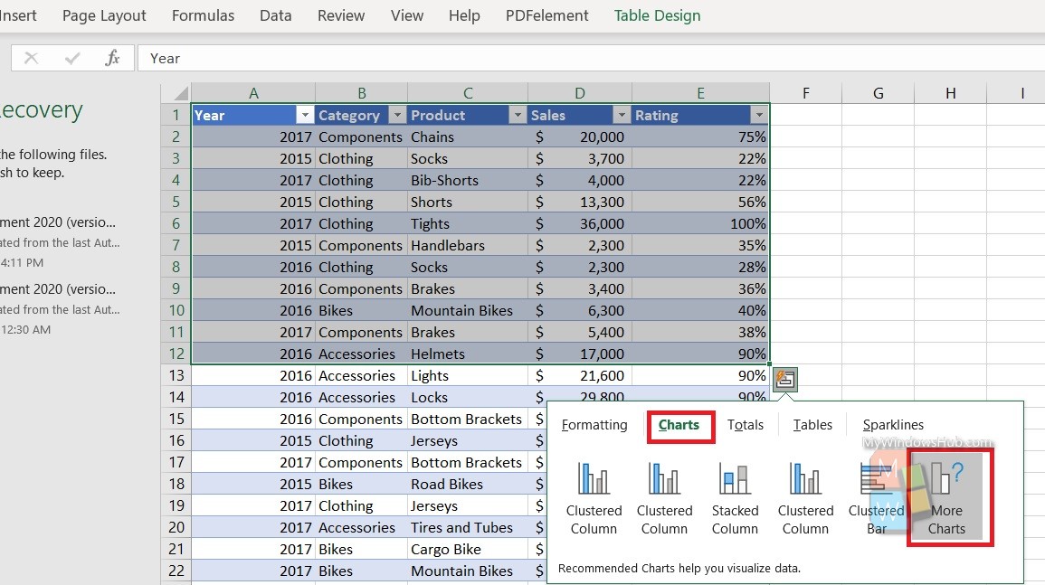
Select Charts. As you select the Charts tab, select More Charts.
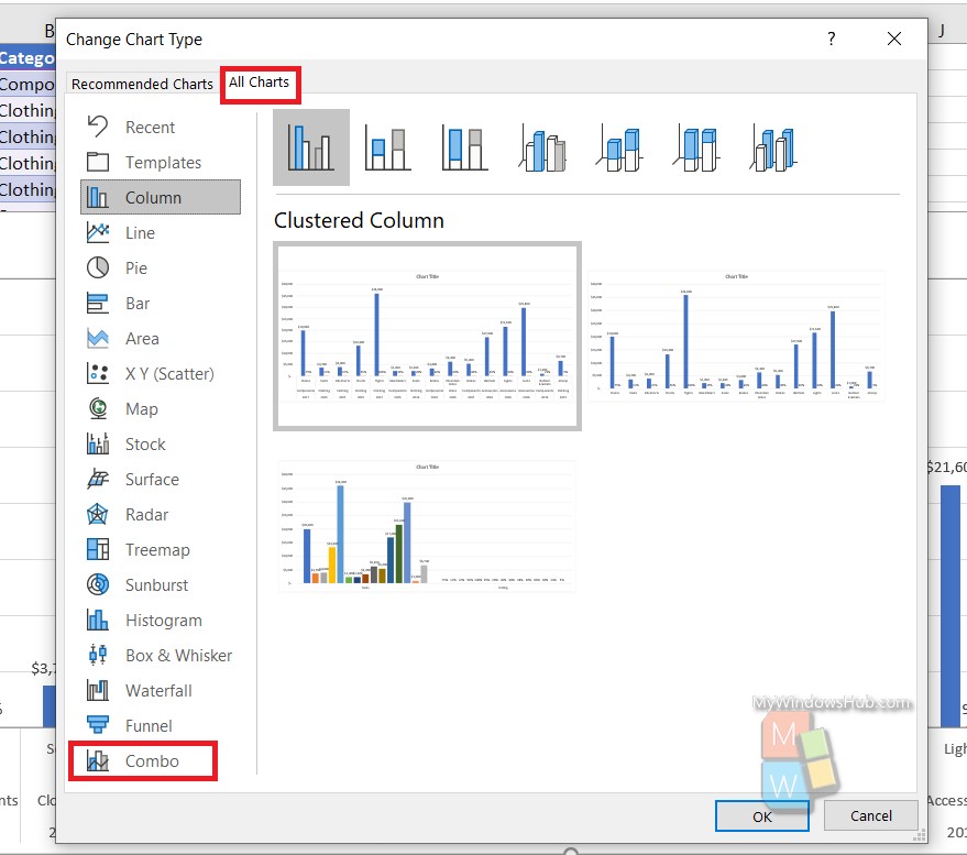
Next, as the Change Chart Type window opens, go to All Charts. Select Combo.
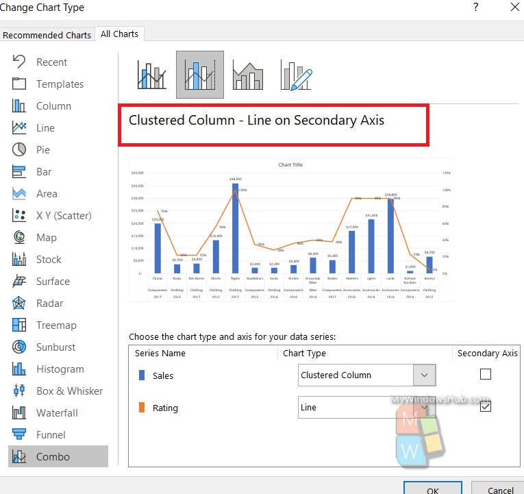
Select any chart you want. Click on OK.
That’s all!