Microsoft Excel is an extremely popular Office application among students, offices, researchers. It facilitates a plethora of options to create a huge table. You can create graphs, pie charts, trends of a particular business or scientific model and so on. The numbers of features are almost endless.
While we are doing data analysis, we often want to check the general nature of the data by plotting a line that best fits the curve. This curve is called trendline, which gives information about the general pattern and direction of the data, the variation of the data over a period of time, etc. In MS Excel, if you are working with data over a period of time, you may want to have a deeper analysis of the overall pattern of the data. In such cases, you may require to plot a trendline on your data chart. Trendline can be applied, only if you are working with more than one data series.
The process of plotting is very simple. I shall show you how to do it, in this article.
Steps To How To Insert A Trendline On Your Data Table Or Chart On MS Excel

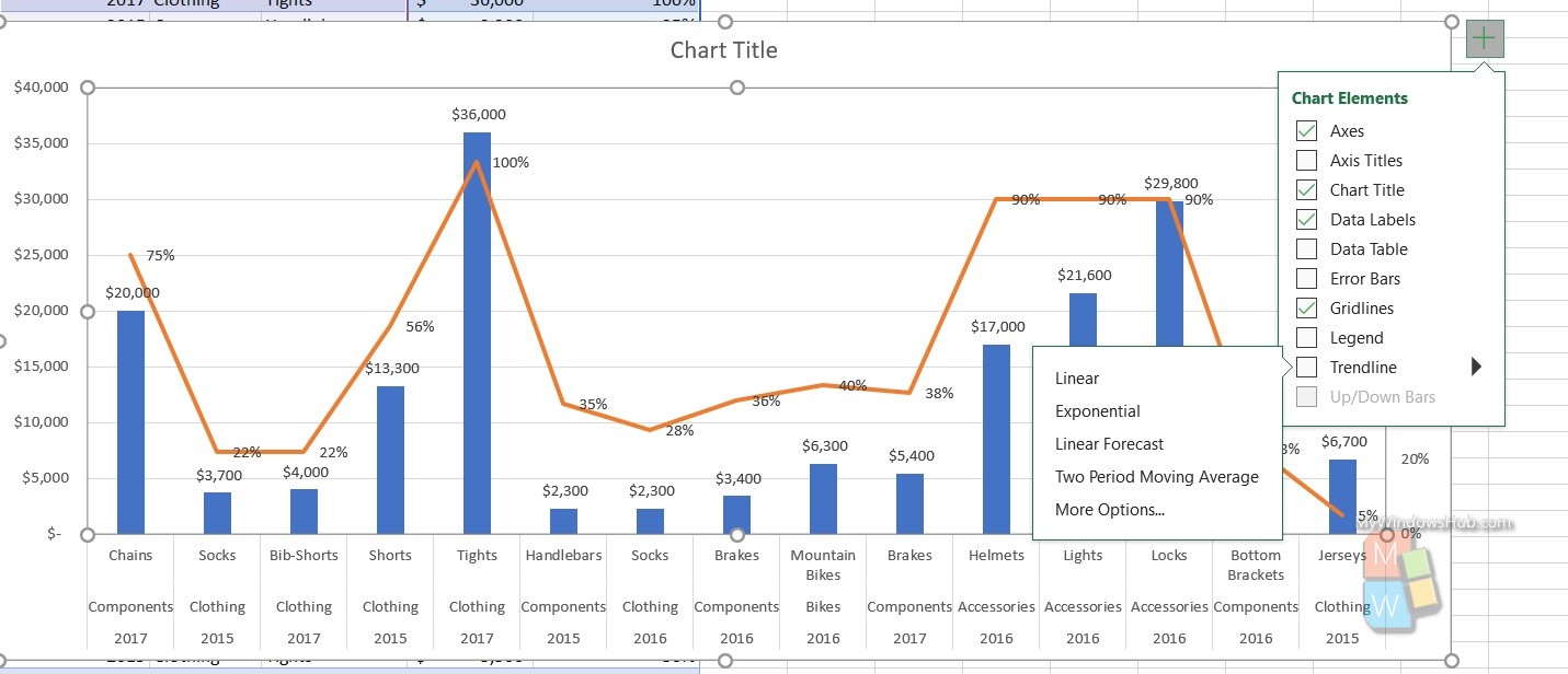
- Select the chart, you are working on.
- Select the + located at the the top right of the chart.
- Select Trendline.
- Click on the dropdown arrow, to select the type of trendline you need, like, Linear, Exponential, Linear Forecast, Two Period Moving Average, etc.
That’s all!

