

Microsoft Excel is an extremely popular Office application among students, offices, researchers. It facilitates a plethora of options to create a huge table. You can create graphs, pie charts, trends of a particular business or scientific model and so on. The numbers of features are almost endless.
In this article, we shall talk about inserting a secondary axis in a chart in MS Excel. We need a secodary axis in a table or a chart, when the table data are of mixed type, complicated in nature with multiple variables. In such cases, representation of data with a single axis is not possible. For example, price and number, percentage and volume, etc. In simple words, when you need to plot more than one type of data series, you have to take help of secondary axes. A secondary axis is suitable for a chart that represents a combination of column and line charts. If you have already plotted a chart or a table, you can insert secondary axis on it, by simply changing your chart to a combo chart.
In this article, I shall show you how to do it
Steps To Insert A Secondary Axis In A Chart On MS Excel
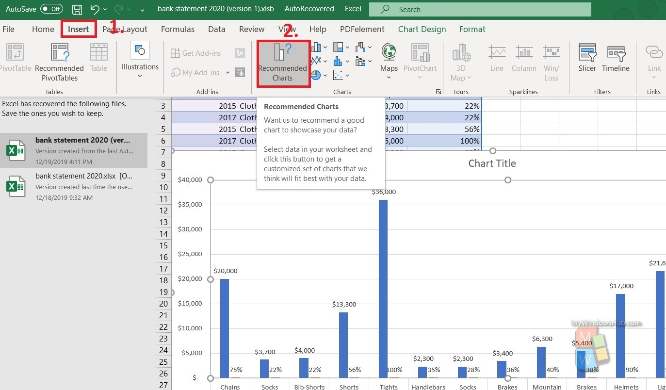
Tap on the Axes of the chart. Then click on Insert. Now, select Recommended Charts.
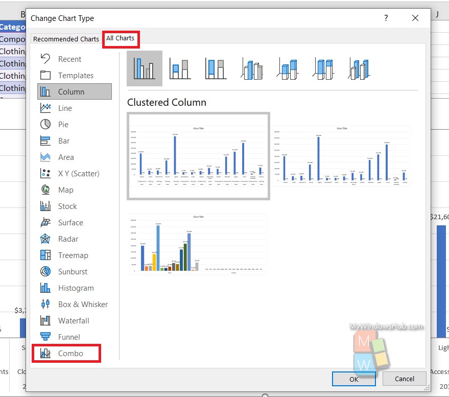
Next, as the Change Chart Type window opens, go to All Charts. Select Combo.
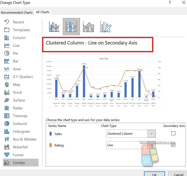
Select Clustered Column- Line On Secondary Axis. Click on OK.
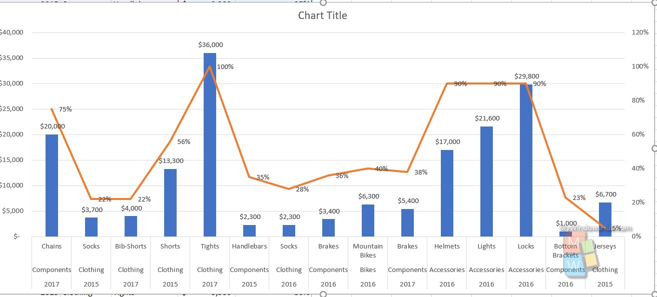
Your chart now has secondary axis.
That’s all!