

In MS Excel, we often work with huge amount of data and perform mathematical operations on them. Sometimes, if the data is huge and the tables are enormous, and we need to represent those data with graphs, it becomes impossible for us to create big tables and charts. In such cases, we use Sparklines to show data trends in MS Excel.
A sparkline is nothing but a small chart in an Excel worksheet cell that provides a visual representation of data. You can insert a sparkline graph in a single Cell. Use sparklines to show trends in a series of values, such as seasonal increases or decreases, economic cycles, or to highlight maximum and minimum values. Position a sparkline near its data for greatest impact.
In the following tutorial, we shall see how to use Sparklines to show data trends in MS Excel Worksheet.
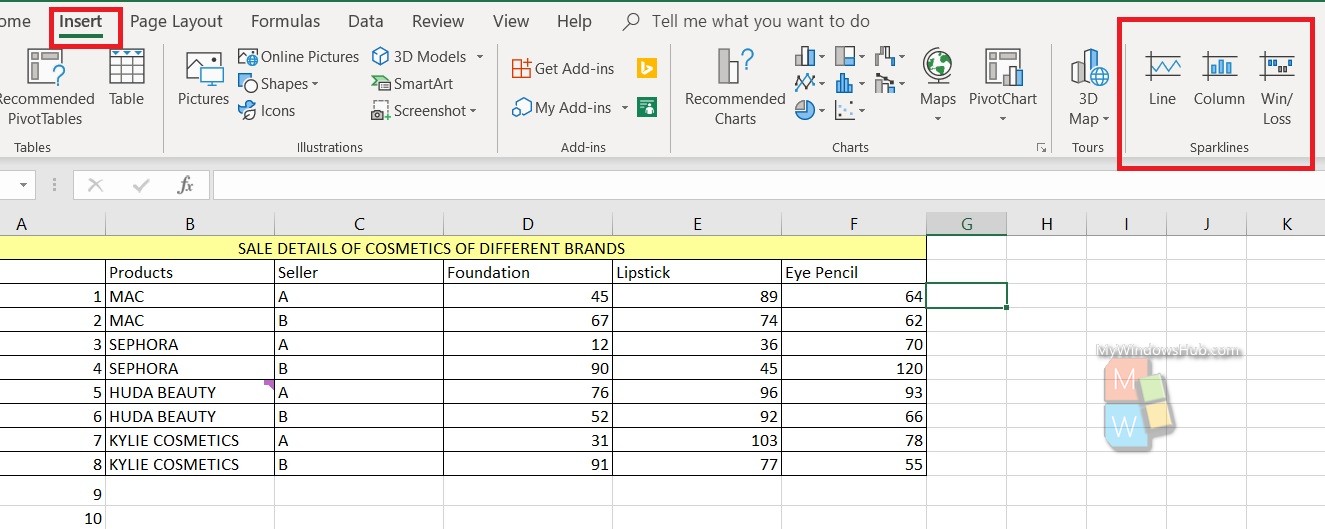
Steps To Use Sparklines To Show Data Trends In MS Excel Worksheet
First of all, select a blank cell at the end of a row of data.
Next, select Insert and pick a Sparkline type. You can choose from any trend such as Line, or Column or Win Loss.
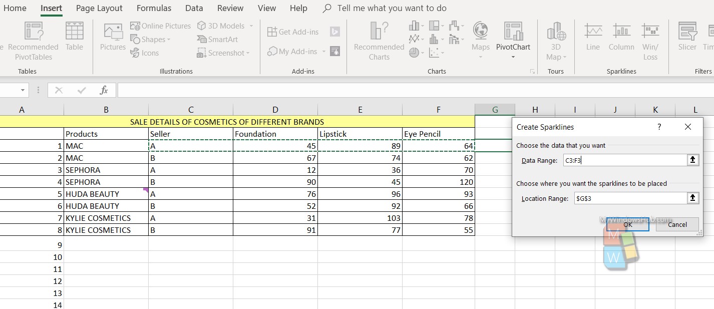
Select the range and click on OK. You will get the chart.
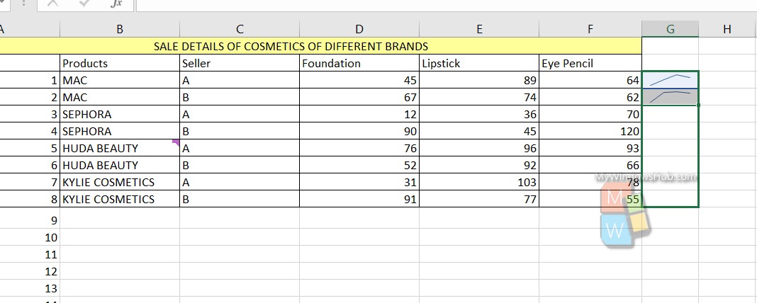
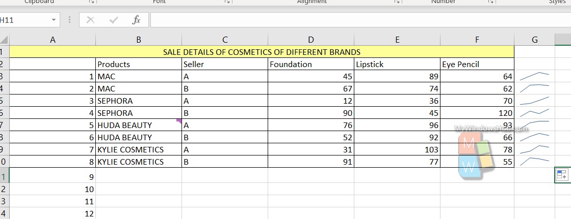
Repeat the process for another row. Now, select both the sparklines, drag and drop up to the number of rows you want. You will get all the trends.
Choose the desired Sparkline chart, choose the design, data chart type, markers, style, sparkline colors, weight, marker color, axes, etc. Select the Sparkline chart.