

Microsoft Excel is an extremely popular Office application among students, offices, researchers. It facilitates a plethora of options to create a huge table. You can create graphs, pie charts, trends of a particular business or scientific model and so on. The numbers of features are almost endless.
You can also show a data table for a line chart, area chart, column chart, or bar chart. A data table displays the values that are presented in the chart in a grid at the bottom of the chart. A data table can also include the legend keys.
While you are working with a chart on MS Excel, you may need to show or hide chart legends, depending on the size of the chart, the variables, the complexity of the chart and so on. If there is two variable, and the chart is quite understandable without the chart legends, you may opt to turn it off. Again if the chart is a big one, with several variables, turning on the legends become necessary.
For this, MS Excel has included a legend key for data tables, so that users can enable or disable chart legend whenever needed.
Steps To Show Or Hide Chart Legend On MS Excel
If you want to SHOW Legend
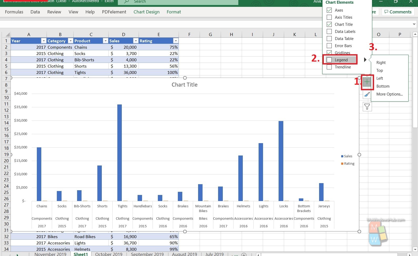
- Select the chart on your MS Excel worksheet, A plus sign will appear at the top right corner of the table.
- Now, you need to point to Legend and select the arrow next to it.
- Choose the location like top, right, left, bottom, i.e., where you want the legend to appear in your chart.
- You are done!
If you want to HIDE Legend
- Simply select the legend and tap delete.
That’s all!