

Microsoft Excel is an extremely popular Office application among students, offices, researchers. It facilitates a plethora of options to create a huge table. You can create graphs, pie charts, trends of a particular business or scientific model and so on. The numbers of features are almost endless.
A bar chart or bar graph is a chart that represents categorical data in the form of rectangular bars with heights or lengths proportional to the values they represent. Bars can be plotted horizontally as well as vertically. It shows comparisons between discrete values from discrete categories.
In the following article, we shall show you how to create a bar graph in MS Excel with the help of a simple table. You can create bar graphs for complex tables also, by following the same method.
Steps To Create A Bar Chart In MS Excel
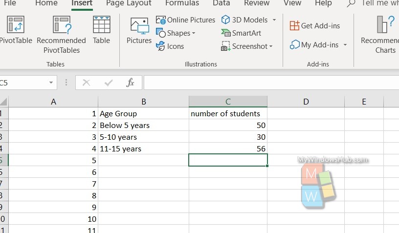
Here is a simple table. We are going to create the bar graph with this.
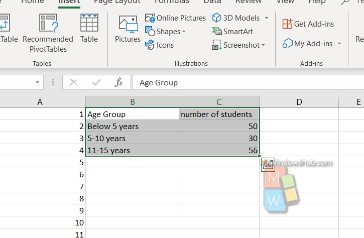
Select the columns and rows only that you want to apply on the bar graph.
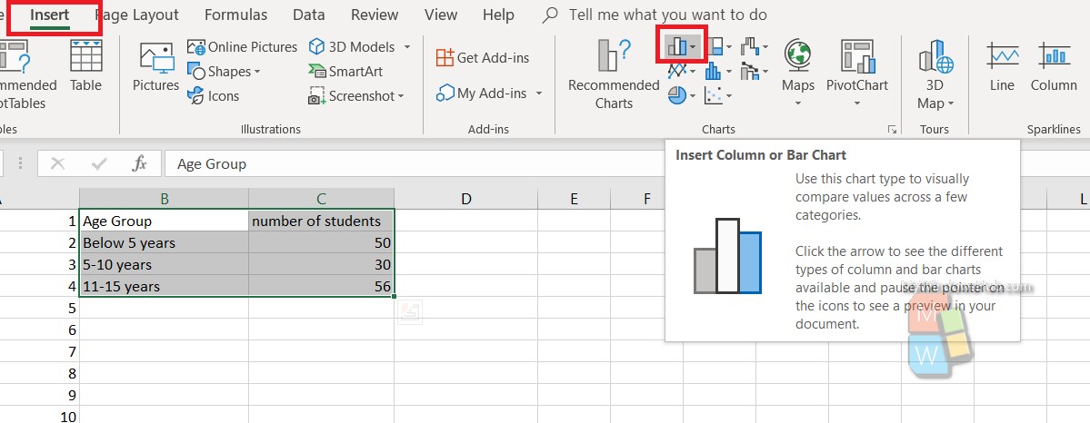
Next, click on Insert and then click on Bar diagram icon as shown in the image.
Now, select a bar chart of your choice.

That’s all!